
Stuck for content ideas? Numbers and visuals can often be a good place to start.
It’s no secret that audiences respond well to both statistics and visuals.
When you combine stats or numbers into an information graphic it’s a potent combination that can draw real attention for your business.
Information graphics often feature a strategic arrangement of icons, illustrations, numbers, and copy to help you communicate a large amount of information in a small space.
But you can also create – or source – illustrations that can be customized along with a given statistic. “… sometimes it takes a clever combination of words and pictures to tell a story quickly, concisely and in an entertaining fashion.” —Creative Blow
“Infographics” have certainly become popular across the web for content marketing, article support, gated content, and SEO efforts.

Why have infographics and illustrations become so popular? Facts and statistics that might be less than exciting within a longer article can suddenly be made much more interesting when represented visually.
Because the data can be “seen” rather than just “read” it becomes more compelling and requires less commitment on the part of the reader. “… people love facts, figures and statistics. Add some compelling images and graphics and …”voila“, you have addictive content!” —Jeff Bullas

Our team has been cleverly devising information graphics for years. Workflow illustrations are a form of infographic we regularly use to help simplify complex software, hardware, and network processes for brochures, videos, web sites, presentations, and more. Also consider that infographics have become quite effective pieces of gated content lately.
Don’t forget, you can also enhance your white papers or gated content with images, illustrations, and information graphics as needed.
Let us know if you’d like help putting together some powerful infographics that can help you build more interest for your business.

Get Your Free Business Writing eBook Now
Need to move forward on a difficult writing project? This practical guide will help you get started. Send a link directly to my inbox:
Sources may include:
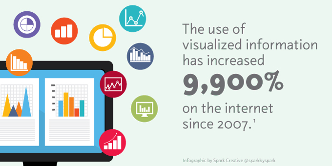
1. Google Trends, as reported via NeoMam Studios
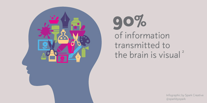
2. Video Infographic: Your Brain on Visualization, KissMetrics
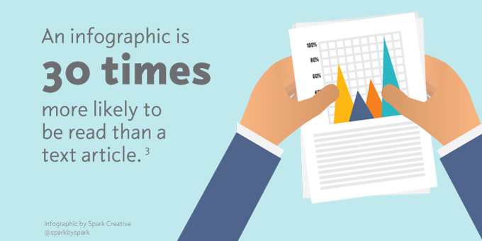
3. 3M via Hubspot, 19 Fascinating Statistics That Make the Case for Using Visual Content in Your Marketing
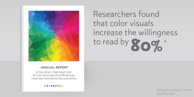
4. The Persuasive Properties of Color, Marketing Communications, Green, R.
5. 9 Awesome Reasons to Use Infographics in your Content Marketing, Jeff Bullas
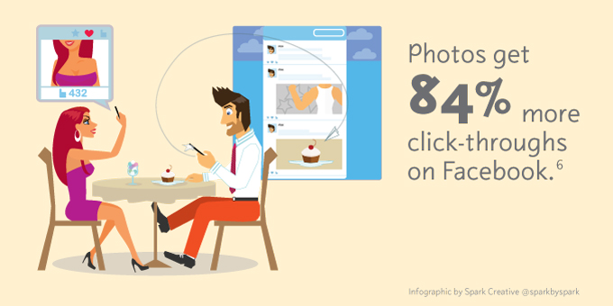
6. How To Get More Likes on Facebook, Kissmetrics
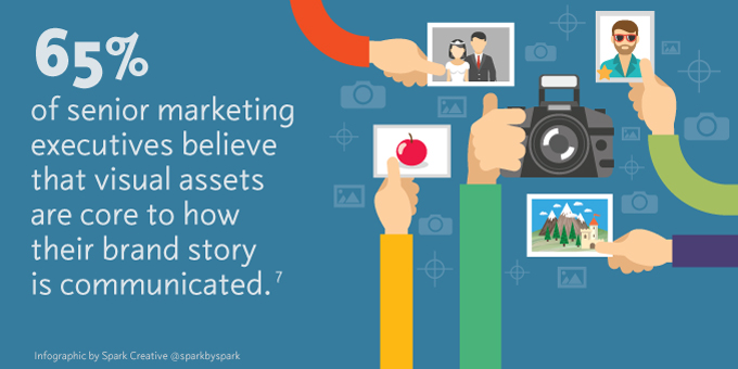
7. 37 Visual Content Marketing Statistics You Should Know in 2016, Jesse Mawhinney, Hubspot
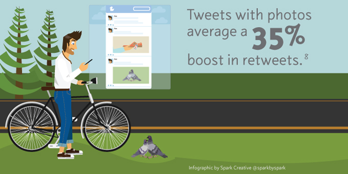
8. Twitter, reported by Social Media with Priyanka
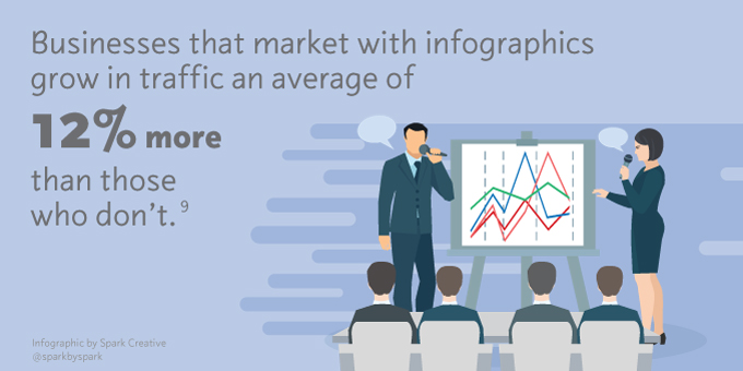
9. 10 Reasons Visual Content will Dominate 2014, James Scherer, WishPond